
If guests struggle to find restrooms, poor sign placement is likely the cause. Signs placed too low, hidden behind obstacles, or far from main pathways make it hard for visitors to notice them. Insufficient lighting and dull colors also hinder visibility. By positioning signs along main routes at eye level and using clear, contrasting colors with proper lighting, you enhance wayfinding. Keep these tips in mind to improve your signage effectiveness—you’ll discover more insights ahead.
Key Takeaways
- Signs placed too high, too low, or behind obstacles reduce visibility, causing guests to overlook important cues.
- Poor lighting or dull colors diminish sign visibility, especially in dim areas or at night.
- Insufficient or confusing placement along main pathways and decision points leads to guest hesitation.
- Lack of clear, consistent directional cues causes guests to become disoriented and search longer.
- Cluttered or inconsistent signage layouts overwhelm guests, making it harder to locate restrooms efficiently.
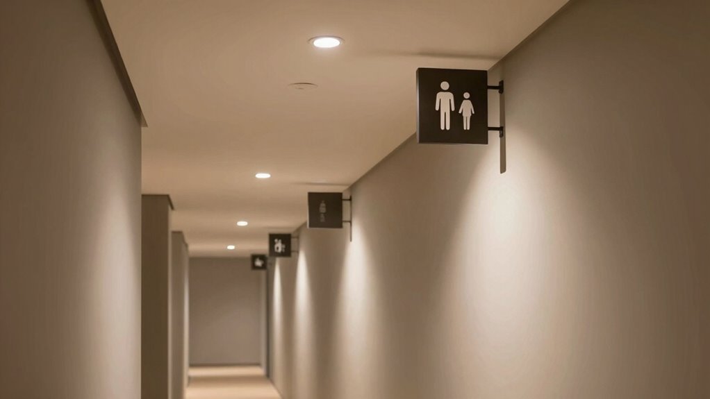
Effective signage placement can notably influence how quickly and easily people find what they’re looking for. When it comes to guiding guests to restrooms, strategic positioning matters just as much as the signs themselves. Your goal should be to minimize confusion and ensure that visitors feel confident about where they’re headed. One key element often overlooked is lighting design. Proper lighting not only makes signs more visible but also draws attention to essential directional cues. Bright, well-placed lights highlight signs at night or in dimly lit areas, preventing guests from missing important information. Conversely, poorly lit signs can blend into the background, causing delays and frustration. Using focused lighting, such as spotlights or backlit signage, enhances visibility and reinforces the importance of the directions given.
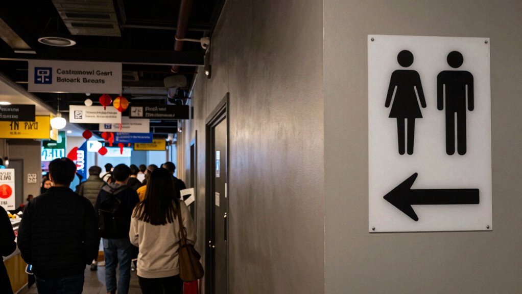
Alongside lighting, color psychology plays a significant role in signage effectiveness. Certain colors evoke specific emotions and reactions, influencing how quickly someone responds to a sign. For example, bold reds and oranges tend to grab attention and prompt immediate action, making them ideal for urgent or important directions. On the other hand, calming greens and blues can create a reassuring atmosphere, guiding guests gently without overwhelming them. When designing signs, consider how color choices affect perception. Bright, contrasting colors can improve readability from a distance, while softer hues may be better suited for signs that are closer to the target area. Combining these strategies ensures your signage isn’t just seen but also understood and acted upon swiftly.
Placement is equally vital. Signs should be positioned at eye level and in clear sightlines along main pathways. Avoid cluttering corridors with too many signs, which can cause visual confusion. Instead, use a logical sequence that leads guests naturally toward the restroom. If your space has multiple levels or long hallways, consider adding directional cues at key decision points, such as intersections or entrance areas. Consistency in placement helps guests develop a mental map, reducing hesitation and streamlining their journey. Remember, even the best-designed signs are ineffective if they’re hidden behind obstructions or placed where guests rarely look. Regularly assess sightlines and adjust placement to maximize clarity.

HPMCVE LED Restroom Sign for Door, Wall Mounted Bathroom Decor, Neon Lighted Toilet Signage with Paper Texture. Backlit WC Plate for Home, Bar, Villa or Restaurant; 3 Sizes, 110-240V
- Artistic Hollow-Out Design: Creates warm, inviting glow with paper texture
- Sturdy Material Construction: Made with stainless steel and acrylic for durability
- Customizable Toilet Signage: Includes 9 options across 3 sizes for men, women, and toilet
As an affiliate, we earn on qualifying purchases.
As an affiliate, we earn on qualifying purchases.
Frequently Asked Questions
How Does Lighting Affect Restroom Signage Visibility?
Lighting plays a vital role in restroom signage visibility, ensuring your wayfinding signs stand out. Bright, well-placed lighting helps avoid common wayfinding myths that poor signage or placement confuse guests. By illuminating signs effectively, you guide guests smoothly to restrooms and enhance their experience. Proper signage placement combined with strategic lighting maximizes visibility, making it easier for everyone to find what they need without frustration or confusion.
What Colors Are Most Effective for Directional Signs?
You should choose bold, high-contrast colors like black on yellow or white on blue for directional signs, as they maximize signage contrast. Color psychology shows these colors grab attention quickly, making your signs more effective. Bright, clear hues help guests spot restroom signs from a distance, reducing confusion. Prioritize visibility and contrast to guide guests efficiently, ensuring they find restrooms without frustration or delay.
How Does Signage Size Influence Guest Comprehension?
Signage size considerably shapes guest comprehension by making signs more noticeable and readable. Larger signs attract attention and guarantee clarity from a distance, reducing confusion in guest navigation. Proper signage placement combined with appropriately sized signs guides guests smoothly, minimizing misdirection. When signs are too small, guests struggle to see or understand them, leading to frustration. So, prioritize prominent, well-sized signage to optimize orientation and make sure guests effortlessly find their way.
What Role Does Signage Font Choice Play in Visibility?
You should prioritize font choice because it directly affects signage visibility. Opt for clear, legible fonts with good contrast to guarantee guests can easily read signs from a distance. Avoid overly decorative or thin fonts that compromise legibility. Maintaining consistent font style across all signs reinforces design cohesion, making the signage more intuitive. By focusing on font legibility and design consistency, you make it easier for guests to find restrooms quickly.
How Do Cultural Differences Impact Signage Interpretation?
You need to take into account cultural differences because cultural symbolism and language barriers affect how guests interpret signage. Symbols that seem clear in one culture might be confusing or misinterpreted in another. Language barriers can lead to misunderstandings or missed signs. To improve visibility, use universal symbols and simple language, and make certain your signage respects cultural nuances. This approach helps all guests easily find restrooms, regardless of their background.
Conclusion
Understanding signage placement psychology is key to improving guest experience. Even with clear signs, about 30% of visitors still struggle to find restrooms, highlighting the importance of strategic placement. When signs are easily visible and intuitive, it reduces confusion and frustration. Next time you’re designing signage, remember that a well-placed sign can considerably enhance wayfinding, making your space more welcoming and accessible. Small adjustments can make a big difference in hospitality and retail environments.