
To create a wayfinding system your guests will follow, start by mapping your space to identify key guidance points like entrances and restrooms. Place signs strategically and guarantee they match your interior style for visual harmony. Use clear fonts, icons, and high contrast for readability. Regularly review and update signs to stay aligned with your evolving space and branding. By following these steps, you’ll develop an intuitive sign plan—learn more to enhance your guests’ experience.
Key Takeaways
- Map the space thoroughly to identify key guidance points and strategic placement locations.
- Match signage style and design with interior aesthetics to ensure visual harmony.
- Use consistent fonts, colors, and icons for clarity and easy recognition throughout the space.
- Place signs at logical points like entrances, exits, restrooms, and major zones for intuitive navigation.
- Regularly review and update signage to maintain effectiveness and align with any space or branding changes.
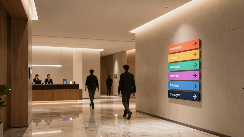
Creating a clear and effective sign plan for guests is essential to guarantee they find their way effortlessly. When you design your signage, it’s crucial to consider how it integrates with your overall interior design. Thoughtful signage doesn’t just direct; it enhances the aesthetic and reinforces your brand identity. Consistent branding across all signs—using the same fonts, colors, and style—creates a seamless experience that feels intentional and professional. This uniformity helps guests feel confident they’re in the right place and reduces confusion, especially in larger or complex spaces.
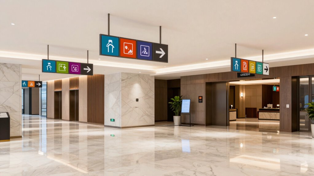
Start by mapping out your space carefully, identifying key points where guests need guidance—entrances, restrooms, exits, and major rooms or zones. Your signage should be positioned strategically at these junctures, making navigation intuitive. When planning, consider how each sign complements your interior design. For example, if your space has a modern look, opt for sleek, minimalist signs with clean lines and contemporary fonts. If your interior features warm, rustic elements, choose signage with natural textures or vintage-inspired typography. This harmony between signage and interior design not only boosts visual appeal but also reinforces your branding message.
Branding consistency extends beyond aesthetics. Use the same tone and style across all signs to create a cohesive experience. This might mean adopting a specific color palette associated with your brand or using a particular icon style that appears throughout your space. Consistent signage helps guests quickly recognize directions and reduces cognitive load, making their journey smoother and more pleasant. It’s also a subtle way to communicate professionalism and attention to detail, which can leave a lasting positive impression.
When designing your signs, keep them simple and easy to read. Use clear, legible fonts and avoid clutter. Pictograms or icons can be helpful, especially for international guests or those with visual impairments. Make sure the text size is large enough to be seen from a distance, and ensure the contrast between text and background is high for maximum readability. Incorporate your brand’s color scheme thoughtfully, so signs stand out without clashing with your interior design. Additionally, understanding the importance of signage placement can greatly improve guest navigation and overall experience.
Regularly review and update your signage to keep it relevant and aligned with any changes in your space or branding. A well-thought-out sign plan isn’t a one-time project; it evolves with your space. When you prioritize interior design and branding consistency in your sign plan, you’re not just guiding guests—you’re creating an immersive environment that reflects your brand’s personality and commitment to quality. Guests will appreciate the clarity, professionalism, and aesthetic harmony, making their experience memorable for all the right reasons.

SignWays Custom Left or Right Arrow Signs 12"x12" | Personalized Square Directional Sign | Wayfinding Marker for Business, Parking, Deliveries | Professional Grade Visibility Day & Night | Made in USA
Custom Directional Arrow Sign – Create a personalized arrow sign with custom text, colors, and arrow direction to…
As an affiliate, we earn on qualifying purchases.
As an affiliate, we earn on qualifying purchases.
Frequently Asked Questions
How Do I Prioritize Signage for Different Guest Demographics?
You should prioritize signage by considering guest preferences and ensuring signage accessibility for all. Start by identifying your key demographics and their needs, then create clear, easy-to-understand signs that cater to diverse abilities. Use high-contrast visuals and large fonts for visibility, and place signs where guests naturally look. Regularly gather feedback to refine your approach, making sure your signage effectively guides every guest seamlessly.
What Materials Are Most Durable for Outdoor Wayfinding Signs?
Imagine installing signs at a busy park, where weather resistance and vandal-proof materials matter most. You should choose aluminum or high-density polyethylene (HDPE) for outdoor wayfinding signs, as they’re highly durable, weather-resistant, and vandal-proof. These materials withstand rain, sun, and physical damage, keeping your signs legible and intact longer. Using such robust options guarantees your signage remains effective, even in harsh outdoor environments.
How Can I Incorporate Digital Signs Into My Plan?
You can incorporate digital signs into your plan by adding interactive displays and seamless digital integration. Position these signs at strategic locations to guide guests efficiently, and use touchscreens or motion sensors to make navigation engaging. Guarantee the digital content is clear and consistent with your overall signage system. Regularly update information to keep it relevant, and integrate with your existing wayfinding elements for a cohesive guest experience.
What Are Common Mistakes to Avoid in Sign Placement?
You should avoid placing signs where they create visual clutter or distract guests. Keep your signs consistent with your branding to prevent confusion, and don’t hide important signs among less critical ones. Position signs at eye level and along main pathways, ensuring they’re easy to read. Steer clear of overloading any single area with too many signs, which can overwhelm guests and reduce the overall effectiveness of your wayfinding system.
How Do I Measure the Effectiveness of My Sign Plan?
Sure, because nothing screams success like guessing if your signs are working. To measure effectiveness, track guest satisfaction through surveys or direct feedback, and observe signage visibility during peak times. Are guests easily finding their way? If they’re still lost, your sign plan’s failing. Use these clues to fine-tune your signage, ensuring guests are happy, and your wayfinding system actually works—because nothing beats tangible proof of success.

Attraction Design Wood Family Sign (Set of 2)
Model Number: FW1003
As an affiliate, we earn on qualifying purchases.
As an affiliate, we earn on qualifying purchases.
Conclusion
Now that you understand the essentials of a compelling sign plan, the real challenge begins. Will your signs truly guide guests seamlessly or leave them wandering? Every choice you make shapes their experience—and their perceptions. One overlooked detail could lead to confusion or frustration. Are you ready to design a wayfinding system that not only directs but also delights? Stay tuned, because the next step might just redefine how your guests navigate your space forever.

VIBE INK Large 24"x18" – Event Parking with Left or Right Directional Arrow Yard Sign – Printed Front & Back – Made in USA – Corrugated Plastic – Metal H-Stake Included
Sign Size: 24 inches in length x 18 inches in height. Made in the USA. High visibility Parking…
As an affiliate, we earn on qualifying purchases.
As an affiliate, we earn on qualifying purchases.

Bathroom Signs Wooden (Brown w/Wood Man)
Stylish Design – Laser cut icons mounted onto round wooden bases make for stylish bathroom door signs that…
As an affiliate, we earn on qualifying purchases.
As an affiliate, we earn on qualifying purchases.